Queen’s University CE
Client
Queen’s University (in collaboration with KnowledgeNow)
Brief
Queen’s University asked us to create a short, welcoming 2D animated explainer that introduces their Community Engagement Framework in a way that feels friendly, inclusive, and immediately useful to undergraduate audiences and campus partners.
The film distills a complex framework into a clear narrative arc: what community engagement looks like at Queen’s, why it matters, and how students and staff can participate. We anchored the visual language in Queen’s brand feel while adding a bright, contemporary motion style so the message lands with energy rather than bureaucracy.
Key topics visualized in the piece include:
Belonging & Disability (access-first, visible mobility aids)
Gender-based & relational violence / healthy relationships (care, consent, support)
Health & well-being (safety nets, hands-holding figures)
Medicine Wheel (represented with care and cultural respect)
Arts & campus life (microphone, performance, student expression)
Tone targets: youthful, inviting, compassionate, and practical.
Scope
Creative direction & story development
Script adaptation and VO performance direction (youthful, upbeat delivery)
Master storyboard & timing map with exact VO lines and transition notes
Icon system & motion language (dialogue strings that connect concepts)
2D animation & compositing
Accessibility passes (readability, color contrast, caption-ready)
Final mastering for campus screens and digital distribution
HIGHLIGHTS
Clarity out of complexity: translated policy/framework language into a clean, 3-act visual story students actually want to watch.
Inclusive iconography: characters and scenes depict visible disability, care, and compassion without tokenism; motion choices emphasize safety and agency over spectacle.
Respectful representation: the Medicine Wheel appears with careful framing and pacing, avoiding decorative use and underscoring its meaning in context.
Signature motion motif: “dialogue strings” connect ideas around the frame; the framework gently ‘unfolds’ rather than snapping on, reinforcing openness and collaboration.
2.5 week tight turnaround, zero drama: we built a precise, text-only master storyboard PDF early so stakeholders could lock VO timing and scene order before animation, saving rounds and cost.
Development
1) Research & tone test
We converted the framework text into a conversational outline, then ran VO tone tests (too formal → more youthful, but with authority). We validated that shorter sentences + active verbs kept the pace while preserving accuracy.
2) Script & master storyboard
We produced a text-only master storyboard with VO lines, durations, and animation notes. This artifact became the spine for approvals, sound pacing, and scene count—preventing late surprises and keeping delivery on schedule.
3) Design system & iconography
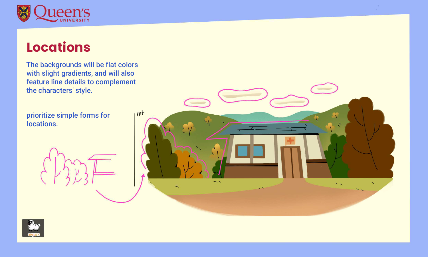
We built an icon set that balances clarity, warmth, and accessibility: rounded corners, clear silhouettes at small sizes, and motion-friendly shapes. Color choices maintain high contrast and caption-friendly backgrounds.
4) Animation & compositing
Animation favors gentle easing and readable arcs; we avoid chaotic wipes and instead use thread-like “dialogue strings” to carry the viewer through topics. Compositing adds depth with soft parallax and shadow separation for legibility.
5) Final delivery & accessibility
We delivered clean masters for campus screens and digital channels, with caption-ready audio spacing (room for sentence breaks) and safe lower-third regions for on-screen text.
Seen Enough? Let’s Build Yours.
If you need a complex idea turned into a clear, human animated story, without the usual production chaos, reach out. We’ll bring the same precision, care, and speed to your project.


